
One of the first things you notice when drilling down into the New York Citibike data, is that there are a lot more male users than female. It’s quite a striking difference between the sexes, and has been picked up in the media. In this post I’m going to look at the way Citibike usage differs across the sexes.
There are two types of Citibike users: long-term Subscribers to the service, and short term Customers who might only buy a weekly pass. Limited information is collected from pass buyers, but Subscribers are asked for their gender and birth_year, so it is possible to drill into this question a little.
Proportion of users
Let’s start with the basics. Of the 10407546 journeys recorded so-far, men made more than three times as many journeys as women.
require(dplyr)
require(magrittr)
require(lubridate)
require(ggplot2)

bikes %>%
  dplyr::group_by(
    gender
    ) %>%
  dplyr::summarise(
    count = n(),
    prop = paste(
      round(
        (n()/nrow(bikes))*100
        )
      )
    )
## Source: local data frame [3 x 3]
##
## gender count prop
## 1 M 7034753 68
## 2 F 2124276 20
## 3 NA 1248517 12So women have definitely been using the service less, but perhaps they have been slower to adopt the scheme? How is the proportion of total users from each sex changing over time?
Looking at the plot below, you can see the seasonal dip in short term pass users over winter (the grey region), and a consequent increase in the proportion of male users, but the proportion of female users is fairly constant at around 20%.
bikes %>%
  dplyr::mutate(
    my = format(starttime,"%m/%y")
    ) %>%
  dplyr::group_by(
    my
    ) %>%
  dplyr::mutate(
    month_total = n()
    ) %>%
  dplyr::group_by(
    gender,
    add = TRUE
    ) %>%
  dplyr::mutate(
    prop = (n()/month_total)*100
    ) %>%
  dplyr::summarise(
    prop = mean(prop)
    ) %>%
  ggplot() +
  aes(
    x = my,
    y = prop,
    fill = gender,
    group = gender,
    colour = gender
    ) +
  geom_area(
    alpha = 0.3
    ) +
  ylab("Proportion of users (%)")+
  xlab("Year and Month")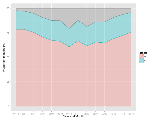
Since many people seem to use Citibikes to get to work Monday - Friday, usage patterns may change at the weekend…
bikes %>%
  dplyr::mutate(
    my = format(starttime,"%m/%y"),
    wday = wday(starttime),
    we = ifelse(
      wday %in% c(1,7),
      "Weekend",
      "Weekday"
      )
    ) %>%
  dplyr::group_by(
    my,
    we
    ) %>%
  dplyr::mutate(
    month_total = n()
    ) %>%
  dplyr::group_by(
    gender,
    add = TRUE
    ) %>%
  dplyr::mutate(
    prop = (n()/month_total)*100
    ) %>%
  dplyr::summarise(
    prop = mean(prop)
    ) %>%
  ggplot() +
  aes(
    x = my,
    y = prop,
    fill = gender,
    group = gender,
    colour = gender
    ) +
  geom_area(
    alpha = 0.3
    ) +
  ylab("Proportion of users (%)")+
  xlab("Year and Month")+
  facet_wrap(
    ~we
    )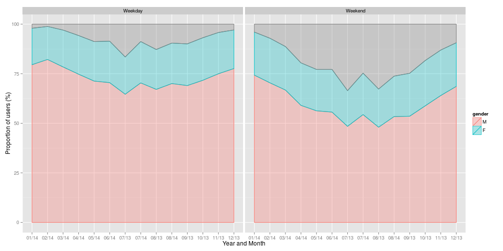
While there looks to be an increase in the proportion of Customers – short term pass holders – at the weekend, especially in the summer months, the overall proportion of female riders remains fairly constant at around 20%.
Journey times
So we now know that men use Citibikes proportionally more than women, but is the way that they are using the bikes different? One of the other variables in the dataset, is journey time (tripduration) in seconds, this is a good start. Let’s start with the numbers:
# Oddly this throws an error without the as.double

bikes %>%
  dplyr::group_by(
    gender
    ) %>%
  dplyr::summarise(
    mean = tripduration %>% mean %>% round,
    median = tripduration %>% as.double %>% median
    )
## Source: local data frame [3 x 3]
##
## gender mean median
## 1 M 745 568
## 2 F 881 686
## 3 NA 1545 1191So from a simple mean and median, it looks like womens’ journeys tend to be longer than mens’, but both are much shorter than the NAs - the unknowns which relate to short term pass holders, for whom data is not recorded. It is also clear that there is some serious skew to the distributions of journeys times, as the medians are not particularly close to the means.
Let’s look at these probability distributions (note that for clarity I have trimmed the data to journeys of less than 3000 seconds or 50 minutes, as the vast majority of journeys are less than this).
bikes %>%
ggplot() +
  aes(
    x = tripduration,
    colour = gender,
    fill = gender,
  ) +
  geom_density(
    alpha = 0.3
    ) +
  scale_x_continuous(
    limits = c(0,3000)
    ) +
  xlab("Trip duration (s)")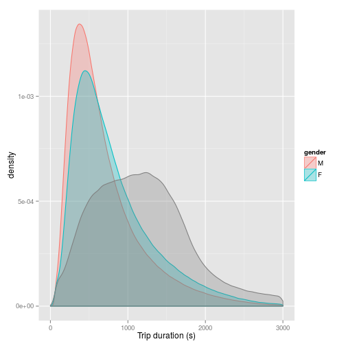
OK…so this is looking a bit more interesting. Two things come out of this plot. Firstly it is clear that the distribution of female journey times matches fairly closely to the distribution of male journey times: most journeys take less than around 500 seconds (about 8 minutes and 20 seconds) - although most female journeys take longer than most male journeys:
bikes %>%
  ggplot() +
  aes(
    x = tripduration,
    colour = gender,
    fill = gender,
    ) +
  geom_density(
    alpha = 0.3
    ) +
  scale_x_continuous(
    limits = c(0,3000)
    ) +
  xlab("Trip duration (s)") +
  coord_cartesian(
    xlim = c(0,750),
    ylim = c(0.001,0.0014)
    )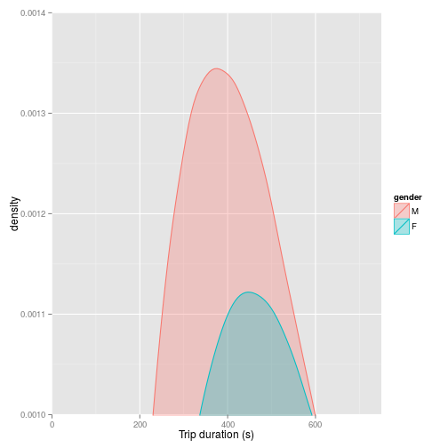
There is much more of a lag to the curve compared to the male curve, and in general, female journey times are longer than male journey times. Of equal interest is the fact that the unknowns - represented by the grey shading - show a markedly different distribution. Although skewed, the distribution is much more symmetrical, with the most common journey time around 1250 seconds.
This suggests a markedly different pattern of use among customers buying short term passes for Citibikes. This makes sense, as the assumption would be that someone paying a subscription to Citibike is using the service regularly – i.e. commuting, whilst short term pass buyers are more likely to be occasional users or tourists. This is something we can explore in more detail.
Knowing that weekends show a different pattern of usage, how does trip duration differ?
bikes %>%
  dplyr::group_by(
    gender,
    we = ifelse(
      wday(starttime) %in% c(1,7),
      "Weekend",
      "Weekday"
      )
    ) %>%
  dplyr::summarise(
    mean = round(mean(tripduration)),
    median = median(tripduration)
    )
## Source: local data frame [6 x 4]
## Groups: gender
##
## gender we mean median
## 1 M Weekday 732 562
## 2 M Weekend 795 592
## 3 F Weekday 862 677
## 4 F Weekend 933 714
## 5 NA Weekday 1480 1123
## 6 NA Weekend 1616 1261So journey times tend to be longer across the board - what about the distributions?
bikes %>%
  dplyr::mutate(
    wday = wday(stoptime),
    we = ifelse(
      (wday %in% c(1,7)),
      "Weekend",
      "Weekday"
      )
    ) %>%
  ggplot() +
  aes(
    x = tripduration,
    colour = gender,
    fill = gender
    ) +
  geom_density(
    alpha = 0.3
    ) +
  scale_x_continuous(
    limits = c(0,3000)
    ) +
  xlab("Trip duration (s)") +
  facet_wrap(
    ~we
    )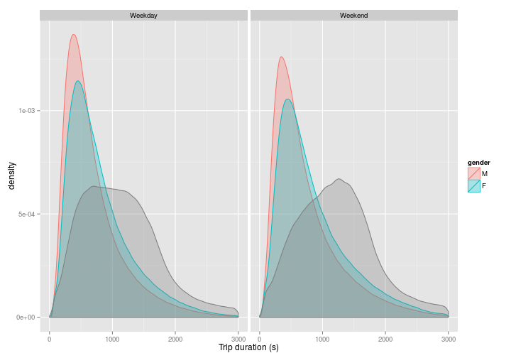
So yes, at the weekend, the peaks are lower but distributed further to the right. This is what we might expect as we might expect, people tend to either take longer journeys, or travel at a more leisurely pace at the weekend, or both.
One of the other variable recorded among regular subscribers, is year of birth. How does this affect things? In this case I’ve cut the data into bins of 0-10, 10-20, 20-30, 30-40, 40-50, 50-60, and 60-100 years; and again considered both weekdays and weekends. In this probabilitys, distribution, I have presented absolute values instead of probabilities, so you get a sense of the number of journeys within each group.
bikes %>%
  dplyr::mutate(
    wday = wday(stoptime),
    we = ifelse(
      (wday %in% c(1,7)),
      "Weekend","Weekday"
      ),
    age = 2014 - as.numeric(birth_year),
    age_group = cut(age,c(10,20,30,40,50,60,100))
    ) %>%
  dplyr::filter(
    !is.na(age_group),
    !is.na(gender)
    ) %>%
  ggplot() +
  aes(
    x = tripduration,
    colour = gender,
    fill = gender
    ) +
  geom_density(
    aes(y= ..count..),
    alpha = 0.3
    ) +
  scale_x_continuous(
    limits = c(0,3000)
    ) +
  xlab("Trip duration (s)") +
  facet_grid(
    age_group~we
    )+
  ylab("Count")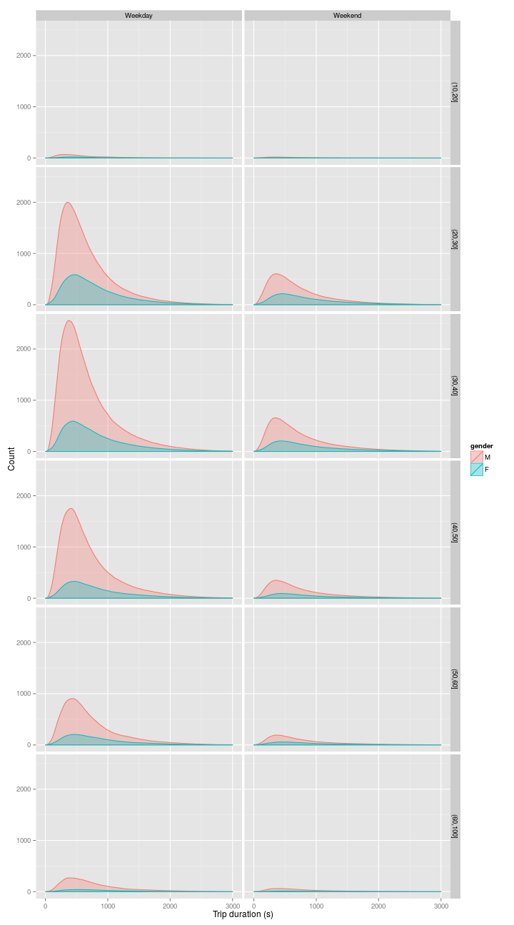
At the weekend, many fewer people travel, and the distribution of journey times is less strongly peaked. All commonsense if we accept the idea that most people who use citibike are doing so to commute.
This plot hints at something else: there were more journeys by 50-60 year old men than women of any single age group.
bikes %>%
     dplyr::mutate(
      wday = wday(stoptime),
      we = ifelse(
        (wday %in% c(1,7)),
        "Weekend","Weekday"
        ),
      age = 2014 - as.numeric(birth_year),
      age_group = cut(age,c(10,20,30,40,50,60,100))
      ) %>%
    dplyr::filter(
      !is.na(age_group),
      !is.na(gender)
      ) %>%
      group_by(
      age_group,gender
      ) %>%
      summarise(n=n())
## Source: local data frame [12 x 3]
## Groups: age_group
##
## age_group gender n
## 1 (10,20] M 62950
## 2 (10,20] F 19602
## 3 (20,30] M 1893220
## 4 (20,30] F 711680
## 5 (30,40] M 2378705
## 6 (30,40] F 708809
## 7 (40,50] M 1555390
## 8 (40,50] F 378938
## 9 (50,60] M 857503
## 10 (50,60] F 249434
## 11 (60,100] M 282912
## 12 (60,100] F 55703sessionInfo()## R version 3.1.3 (2015-03-09)
## Platform: x86_64-pc-linux-gnu (64-bit)
## Running under: Ubuntu 14.04.2 LTS
##
## locale:
## [1] LC_CTYPE=en_GB.UTF-8 LC_NUMERIC=C
## [3] LC_TIME=en_GB.UTF-8 LC_COLLATE=en_GB.UTF-8
## [5] LC_MONETARY=en_GB.UTF-8 LC_MESSAGES=en_GB.UTF-8
## [7] LC_PAPER=en_GB.UTF-8 LC_NAME=C
## [9] LC_ADDRESS=C LC_TELEPHONE=C
## [11] LC_MEASUREMENT=en_GB.UTF-8 LC_IDENTIFICATION=C
##
## attached base packages:
## [1] methods stats graphics grDevices utils datasets base
##
## other attached packages:
## [1] ggmap_2.4 ggplot2_1.0.0 lubridate_1.3.3 magrittr_1.5
## [5] dplyr_0.4.1 testthat_0.8.1 knitr_1.9
##
## loaded via a namespace (and not attached):
## [1] assertthat_0.1 codetools_0.2-11 colorspace_1.2-5
## [4] DBI_0.3.1 digest_0.6.4 evaluate_0.5.5
## [7] formatR_1.0 geosphere_1.3-11 grid_3.1.3
## [10] gtable_0.1.2 jpeg_0.1-8 lattice_0.20-30
## [13] lazyeval_0.1.10 mapproj_1.2-2 maps_2.3-9
## [16] MASS_7.3-39 memoise_0.2.1 munsell_0.4.2
## [19] parallel_3.1.3 plyr_1.8.1 png_0.1-7
## [22] proto_0.3-10 Rcpp_0.11.5 reshape2_1.4.1
## [25] RgoogleMaps_1.2.0.7 rjson_0.2.15 RJSONIO_1.3-0
## [28] scales_0.2.4 sp_1.0-17 stringr_0.6.2
## [31] tcltk_3.1.3 tools_3.1.3