
I’ve been working through a year’s worth of sensor data that I collected using Raspberry Pis. In the last post on this subject I compared my temperature records with records from a local weather station. In this post I’m going to look at the light measurements. I have two main questions I would like to answer:
- Can the light patterns be used to explain the temperature patterns noted in my temperature post.
- Can I separate the patterns of artificial light from natural light.
What are the light measurements?
The light measurements are not strictly measurements of light at all; they are measurements of time taken for a capacitor to fill and discharge. Since the capacitor is attached to a light dependent resistor, longer times indicate a higher resistance (and a darker room), whilst shorter times indicate the inverse.
The data consist of 765977 individual measurements and run from 2015-01-02 to 2015-12-01, with measurements taken at 180 second intervals. These values need to be transformed to make interpretation more intuitive. I’ve played with a few transformations, but my current thinking is to use the normalised inverse of the natural log:
\[y=f \Big( \frac{1}{\ln{x}} \Big)\]Where $f$ is the normalisation function:
\[f(x)=\frac{x - \max x}{\max x - \min x}\]This transformation has three benefits:
- It reverses the values, so that high numbers relate to more light, which is more intuitive.
- It reduces the differences between low and high values, making patterns easier to discern, and reducing the impact of outliers.
- It sets the light values on a scale of 0 to 1, with 0 being most dark, and 1 being most light (across the whole year).
After applying this transformation, 5 further values were highlighted as outliers that were not removed in the initial cleaning described in a previous post, so any light value $<50$ was removed.
With these transformations applied, the year long time series looks like this:
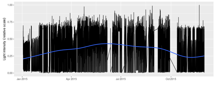
The very simple local regression (loess) highlights some seasonal changes.
Part of this is almost certainly due to me moving the sensor early in the year, but the reason for the step towards the end of the year is not clear, but is probably due to a change in the position of the sensor (it is prone to falling on its side!).
Daily light patterns
Here I replicate the same daily plots from my previous post, also showing values between the $q_{0.25}$ and $q_{0.75}$ as the darker ribbon, and the $q_{0.1}$ and $q_{0.9}$ as the more transparent ribbon outside of this. The trend line is again a locally weighted regression.
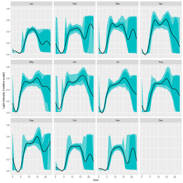
So there are some immediate things that become apparent based on this plot. Firstly, the shortness of the days in the winter months is evident from the narrowness of the first peak in the winter months. The lower light intensity is also clear in the winter months. The second peak in the winter months is caused by artificial lighting.
In March to September, the natural light distribution is bi-modal. These peaks occur at about 09:00 and 15:00, and correspond to the peaks in temperature recorded in my last post, so it looks like solar heating of the front of the house is responsible.
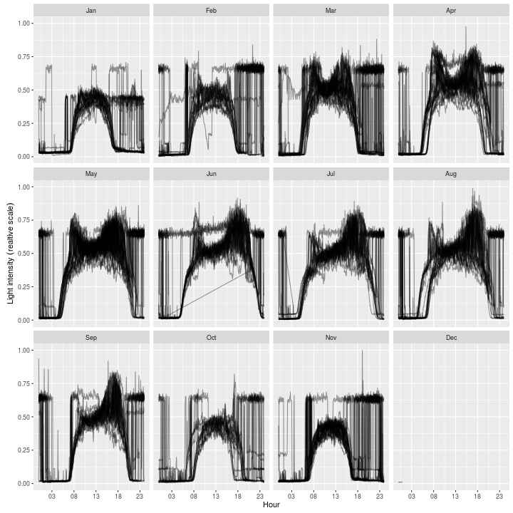
Whilst this plot gives a good sense of the daily patterns over a year, we also lose a lot of information; for instance the steep changes from natural to artificial light. The next plot shows a more ‘raw’ representation where each trace is a day. We can glean a lot more granular information from it:
- It is easy to see the step like patterns of artificial light being switched on and off.
- It’s even possible to work out different levels of artificial light which correspond to the kitchen light being on, but the living room light being off (e.g. early November).
- It looks like there were some problems with time in August and October, when the natural light pattern has been shifted an hour earlier. This was due to some issues I had with the pi keeping the right time, and not correctly staying on GMT.
- Finally, you can see that from September to about April, I got up before the sun rose, and have eaten my breakfast by artificial light.
These data are pretty messy, but it should be relatively simple to pick out the differences between natural and artificial light, and I will attempt this in one of my next couple of posts. Two methods for doing this come to mind:
- Use a window function (maybe over 10 minutes or so) and look for the sharp changes in intensity than would indicate artificial light being switch on and off. This is likely to prove successful in nighttime hours, but it is likely to struggle during partially lit hours, when a drop off my be less acute.
- Another option is to fit a function to the natural light curve, and use this as the basis for identifying points which do not seem to belong (and are therefore artificial). This approach could work, but is likely to be complicated by the bi-modal nature of the distribution during summer months.
Perhaps a combination of the two?