
In my last post I started to delve into a year of sensor data that I have been collecting with my Raspberry Pi sensors. I made some general observations about the data, and went through the process of cleaning it.
In this post I’ll taking a deeper look at the temperature data. I currently have three temperatrue sensors: two internal (one a DS18B20, and a second within an DHT22 combined temperature and humidity sensor) and one external (another DS18B20).
Three questions I am interested in answering in this post:
- How do daily temperature patterns change over the year?
- How much of a difference do I maintain between internal and external temperatures?
- How does the external temperature match local weather station data?
Some basics
To recap from my previous post, the The data run from 2015-01-02 to 2015-12-01, and the cleaned data (with internal sensor data combined) runs to between 100,000-130,000 readings, taken at 180 second intervals.
| Variable | n |
|---|---|
| Internal temperature | 108,477 |
| External temperature | 128,753 |
Daily temperature patterns
So first I’d like to see how the daily patterns have varied across the year.
In the plot below I have plotted the $q_{0.25}$ and $q_{0.75}$ as the darker band in the centre of each ribbon, and the $q_{0.1}$ and $q_{0.9}$ as the more transparent ribbon outside of this.
The trend line is a locally weight regression (loess).
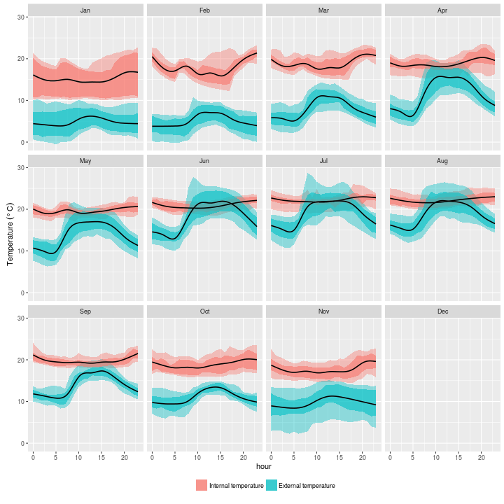
So this plot doesn’t hold too many surprises. internal temperature is generally pretty stable around 20 degrees, whilst external temperature rises with the sun and drops in the evening.
The internal temperature is much more variable in January to March. In the case of January, this is because I spent about two weeks away, and the house cooled down a lot. From the trend lines, you can work out my heating timer settings: a short burst in the morning from around six, and on for a more sustained period in the evening. You can just about see this pattern in May too, but by June through to September, it looks like the timer was off, and possibly back on in October.
Most of the time in June it was marginally warmer outside than inside through the daylight hours. The pronounced peak in the $q_{0.1}$ - $q_{0.9}$ band in the summer months, particularly June and July suggests that sunlight is affecting external sensor readings. The orientation of the house is such that the front wall (where the external sensor is located) gets heated with the rising sun.
Internal vs. external temperature
In the previous plot we saw the trend in internal and external temperatures, and from this we can see that in the winter months, a greater than ten degree difference between internal and external temperatures is maintained.
In summer the situation reverses, as you might expect, and it ends up being warmer outside than inside. This plot is aggregated by the hour however, and it would be good to see this in a little more granularity.
The plot below shows the monthly distribution of the difference between the internal and the external temperature ($\delta$) for every measurement - which for this sensor is every three minutes.
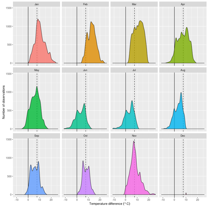
This gives us a much clearer indication of the sort of temperature differential I have been maintaining, and how this varies throughout the year (note that the dashed line shows the grand median of $\delta$: 7.7 Celsius).
You’ll note that in January to March, $\delta$ is entirely positive, meaning that during these months the house was always warmer than it was outside. This situation begins to change from April onwards, and at times the house is more than ten degrees colder than the outside sensor reading in June, July, and August.
This seems a little hard to believe, but looking at the first plot we see that there is a spike in temperatures between 05:00 and 06:00 between April and August (and even rarely in February). This suggests that it is sunlight falling on the front of the house (not the sensor itself which remains in shadow) that causes values of $\delta<0$.
It’s interesting to see also that in some plots, notably June and July, the distributions are bimodal. This also comes out from the first plot, and seems to coincide with warming at around 15:00 in the summer months. Winter months tend to be more normal, which is not surprising, as sun’s movements have less impact on daily temperatures.
How does external temperature match local weather station data
So how do my external temperature readings match up to a real weather station?
For this part of the analysis I am using data Global Summary of the Day data from the World Meteorological Organisation, downloaded through the US National Oceanic and Atmopsheric Administration website.
There are a number of R packages available for downloading this data (e.g. GSODTools), but I’ve not yet found one I like, so I tend to just download the flat files from here.
I’ve worked with GSOD data in my academic work, and whilst it is a great resource, coverage can be a bit patchy. There are also some debates about how accurate this data is (google it), but for my purposes, it should do fine. I’ve downloaded data from the Bedford station, which is the nearest station to me, and has a good record from the 1970s to the preset day.
For 2015, the Bedford station has a nearly complete daily record, with 360 records. Note however, that this is daily summary data, and only gives minimum, mean, and maximum temperatures. There are some data available with more granularity. Maybe I’ll look at these another day.
I re-used some old code to clean the data1, which resulted in no values being removed, so I’m fairly confident in these values.
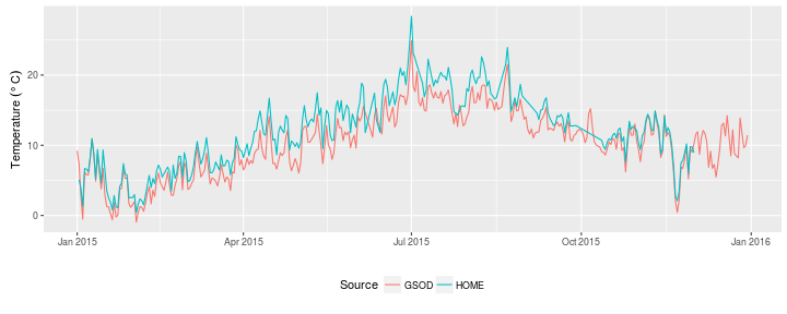
From a first glance, the daily means from the data that I have collected follow the pattern of the Bedford weather data well, but tend to be a few degrees warmer, and more so in the summer than the winter months.
I’ve produced a more informative plot below, with each GSOD observation compared to the daily aggregationg from my measurements.
I’ve also applied a loess model to each measure, not a linear model, although you would be forgiven for thinking so, as the patterns are incredibly linear.
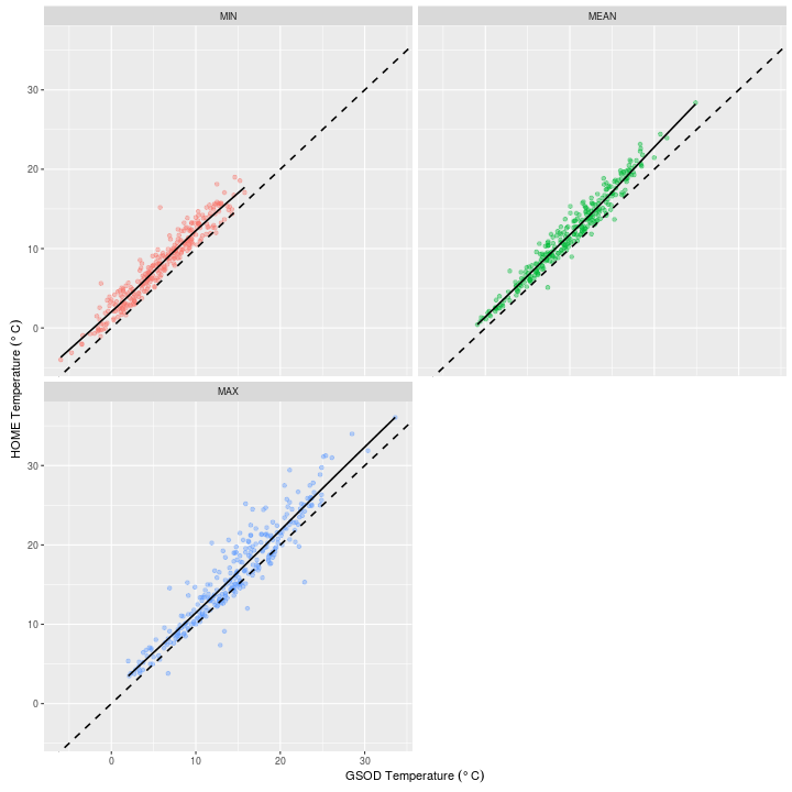
It looks like these fits diverge from the 1:1 line (dashed) slightly more at the higher end of the temperature scale, so I’d expect the slope ($\alpha$) to be $~\alpha>1$ if I were to fit a linear model instead of using loess.
And indeed this is the case ($\alpha$ for each model is given in the GSOD row):
| model | term | estimate | std.error |
|---|---|---|---|
| MIN | intercept | 2.010 | 0.123 |
| MIN | GSOD | 1.022 | 0.017 |
| MEAN | intercept | 1.174 | 0.153 |
| MEAN | GSOD | 1.066 | 0.014 |
| MAX | intercept | 1.015 | 0.336 |
| MAX | GSOD | 1.043 | 0.021 |
So at this level, things don’t look too bad, and given that the weather station is a kew kilometres away, we should expect some difference. For daily average it looks like I could quite easily apply a conversion based on the above models to correct my sensor. I’m reasonably confident that the high negative values of $\delta$ are a result of particularly sunny days. This is a question that I can revisit when I start to look at the light data in a future post, as I suspect that this pattern would have been captured there.