
In my previous post I started looking at the NY CitiBike data, and the differences between the way men and women use the service. It’s clear men use the service more, and that women’s journeys are generally longer; however it’s not clear if this is because they simply travel slower, or because they aren’t always taking the most direct route.
This is a difficult question to answer. Whilst it is easier to know whether the journey time from A to B is longer for men or women, it is not easy to know if the journey was direct. We could simply average it, and hope for the best; given 11 million records, this would probably be good enough, but there is another way making use of the Google maps API.
The Google maps API (accessed using the excellent ggmap) can be queried for distance and cycling journey time between two points. By using this method for a subsample of journeys, we can filter those journeys which take less time than Google suggests it should take, hence we can be more sure (although not absolutely so) that these journeys were direct. We can then have a look at the differences between journey times for men and women.
Note that this turned into a bit of a code heavy post. All the source code to produce this page is available here. You’ll see that I chunked up the steps and saved them out to multiple .RData files to make compilation of the .Rmd quicker.
Step One
- Aggregate all observation by the journey made, and the hour when it was made:
bikes_agg <- bikes %>%
  dplyr::mutate(
    journey = paste(
      start_hash,
      end_hash,
      sep = ""
      ),
    time = round_date(
      starttime,
      "hour"
      )
    ) %>%
  dplyr::filter(
    start_hash != end_hash
    ) %>%
  dplyr::group_by(
    gender,
    start_hash,
    end_hash,
    journey,
    time
    ) %>%
  dplyr::summarise(
    num = n(),
    dur = mean(tripduration)
    ) %>%
  dplyr::arrange(
    desc(num)
    )

# This takes quite a while, so let's save it out as an RData file so we don't have to do it again

save(
  bikes_agg,
  file = "bikes_agg.RData"
  )
Step Two
- Calculate all the possible journeys, and pick a subset of those.
Load the stations data:
stns <- "stns.csv" %>%
  read.table(
    .,
    sep = ",",
    header = F
    ) %>%
  tbl_df

names(stns) <- c("hash","id","name","lat","lon")
Create a table of all the unique journeys:
journeys <- bikes_agg %>%
  dplyr::group_by() %>%
  dplyr::filter(start_hash != end_hash) %>%
  dplyr::mutate(
    start_hash = as.character(start_hash),
    end_hash = as.character(end_hash)
    ) %>%
  dplyr::group_by(
    start_hash,
    end_hash,
    journey
    ) %>%
  dplyr::summarise(
    nobs = n()
)
This gives 105606 journeys out of a possible 1.16281 × 10⁵; plus it is possible for a journey to start and end at the same station, but we are not interested in those, as there is no way to know where someone has been.
Now merge journeys and stns dataframes to give a table with the complete station and journey data:
journeys1 <- merge(
  journeys,
  stns,
  by.x = "start_hash",
  by.y = "hash"
  ) %>%
  merge(
    .,
    stns,
    by.x = "end_hash",
    by.y = "hash"
    ) %>%
  dplyr::select(
    journey,
    start_hash,
    start_id = id.x,
    start_name = name.x,
    start_lat = lat.x,
    start_lon = lon.x,
    end_id = id.y,
    end_name = name.y,
    end_lat = lat.y,
    end_lon = lon.y
    ) %>%
  tbl_df
Step Three
- Query the Google API and get journey times and distance for a subset of journeys.
The Google API limits you to 2500 queries a day, so 2500 seems like a good subset of queries to make. Note that since we can just query the journey dataframe we created in the previous step, not the individual journeys themselves, so we will actually be looking at many more journeys.
# First pick a random subset of the dataset. Best to test this with just a few examples, so you know it is working, then query a larger amount when you are confident that you are not going to use all of your free queries in one go!!

journeys_subset <- journeys1 %>%
  sample_n(
    10
    )

# First organise start and end coordinates into a format that the API will like:

fromx <- paste(
  journeys_subset$start_lat,
  journeys_subset$start_lon,
  sep =  " "
  )

toy <- paste(
  journeys_subset$end_lat,
  journeys_subset$end_lon,
  sep = " "
  )

journey_times <- mapdist(
  from = fromx,
  to = toy,
  mode = "bicycling"
  )
## Source: local data frame [333 x 4]
##
## journey est_dur dist nobs
## 1 00ebe800eb16 1939 8.410 2
## 2 02766b00eb16 1042 4.963 2
## 3 03354b00eb16 1135 4.921 2
## 4 03c8f400eb16 1272 5.285 2
## 5 07458800eb16 1068 4.912 2
## 6 086a9a00eb16 1453 5.966 2
## 7 0a25e000eb16 1648 7.077 2
## 8 0a25e000ebe8 684 2.799 2
## 9 0d717d00eb16 1231 5.466 2
## 10 0ecd1b00eb16 2267 9.916 2
## .. ... ... ... ...# Ok so then bind this to the journeys1 dataframe
journeys_merge <- tbl_df(
cbind(
journeys_subset,
journey_times
)
) %>%
dplyr::select(
-from,-to,-km,-miles,-minutes,-hours
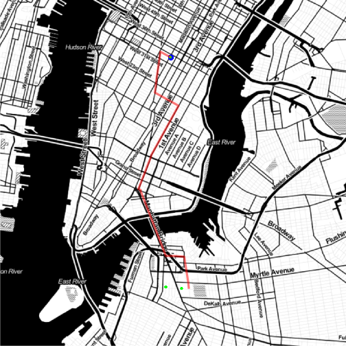
)It’s also possible to query to Google routing API to get a route for each of these journeys. We can plot this to ensure that we have a good coverage across Manhattan Island, but it can also look really nice.
# Write a wrapper function to deal with requests to the Google routing API

get_route <- function(x) {

  fromx <- unique(
    paste(
      x$start_lat,
      x$start_lon,
      sep =  " "
      )
    )

  toy <- unique(
    paste(
      x$end_lat,
      x$end_lon,
      sep = " "
      )
    )

  journey_route <- data.frame() %>% tbl_df

  max_journeys <- c(fromx %>% length,toy %>% length) %>% max

  for (i in 1:max_journeys) {

    try(
      journey_route1 <- route(
        from = fromx,
        to = toy,
        mode = "bicycling"
        )
      )

    try(
      journey_route1 <- cbind(
        i,
        journey_route1
        )
      )

    try(
      journey_route <- rbind(
        journey_route,
        journey_route1
        )
      )
    rm(journey_route1)
    }

  journey_route

  }
Now apply it…
# Again I've just used 10 unique journeys here.

journey_route <- data.frame() %>% tbl_df

for (i in 1:length(fromx)) {

  try(
    journey_route1 <- route(
      from = fromx,
      to = toy,
      mode = "bicycling"
      )
    )

  try(
    journey_route1 <- cbind(
      i,
      journey_route1
      )
    )

  try(
    journey_route <- rbind(
      journey_route,
      journey_route1
      )
    )
  rm(journey_route1)
  }

journey_route
## Source: local data frame [1,043 x 12]
##
## i m km miles seconds minutes hours startLon startLat
## 1 1 178 0.178 0.1106092 28 0.4666667 0.007777778 -73.99654 40.71727
## 2 1 616 0.616 0.3827824 252 4.2000000 0.070000000 -73.99572 40.71875
## 3 1 431 0.431 0.2678234 72 1.2000000 0.020000000 -73.98898 40.71660
## 4 1 150 0.150 0.0932100 42 0.7000000 0.011666667 -73.98427 40.71512
## 5 1 234 0.234 0.1454076 36 0.6000000 0.010000000 -73.98350 40.71633
## 6 1 227 0.227 0.1410578 34 0.5666667 0.009444444 -73.98248 40.71827
## 7 1 290 0.290 0.1802060 49 0.8166667 0.013611111 -73.97998 40.71752
## 8 1 93 0.093 0.0577902 72 1.2000000 0.020000000 -73.97873 40.71995
## 9 2 754 0.754 0.4685356 136 2.2666667 0.037777778 -73.97441 40.72588
## 10 2 538 0.538 0.3343132 134 2.2333333 0.037222222 -73.97873 40.71995
## .. . ... ... ... ... ... ... ... ...
## Variables not shown: endLon (dbl), endLat (dbl), leg (int)And plot it out superimposed over a map of NYC using ggmap.
# Set the centre of the plot

centre <- c(
  lon = mean(stns$lon),
  lat = mean(stns$lat)
  )

# Use the aesthetically pleasing stamen maps

nymap_stamen_to <- get_map(
  location = centre,
  source = "stamen",
  maptype = "toner",
  zoom = 13
  )

# Apply ggplot layers onto ggmap

ggmap(
  nymap_stamen_to,
  extent = 'device',
  legend="bottomright"
  )+
  geom_point(
    data = journey_route %>%
      dplyr::filter(
        leg == 1
        ),
    aes(
      x = startLon,
      y = startLat
      ),
    col = "blue",
    size = 2
    )+
  geom_path(
    data = journey_route,
    aes(
      x = startLon,
      y = startLat,
      group = i
      ),
    lwd = 1.5,
    alpha = 0.3,
    col = "red"
    )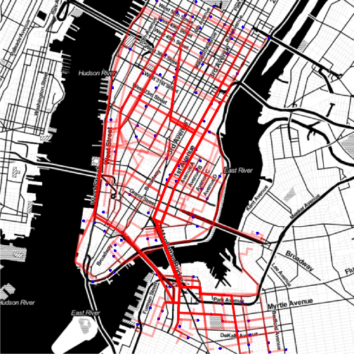
So it looks like we have a reasonable coverage of Manhattan island. You could always query the API on multiple days and combine the output if you wanted to include more than 2500 of the 110,000 possible journeys.
Step Four
- Join
journeys_mergedata with actual journey data frombikes_agg.
bikes_journey_join <- bikes_agg %>%
  inner_join(
    journeys1,
    by =  "journey"
    ) %>%
  group_by() %>%
  mutate(
    hour = hour(time),
    we = ifelse(
      (wday(time) %in% c(1,7)),
      "Weekend",
      "Weekday"
      )
    ) %>%
  filter(
    !is.na(gender)
    ) %>%
  tbl_df %>%
    # Calculate actual speed and predicted speed
  dplyr::mutate(
    speed = (m/dur)*3.6,
    e_speed = (m/seconds)*3.6
    )
## Source: local data frame [258,305 x 22]
##
## gender start_hash.x end_hash journey time num
## 1 M 60f1e0 db982a 60f1e0db982a 2014-04-03 14:00:00 9
## 2 M 4fbd10 a0e5f4 4fbd10a0e5f4 2014-07-31 08:00:00 8
## 3 M 0d717d 225322 0d717d225322 2014-07-28 17:00:00 7
## 4 M 2726a2 ae5b25 2726a2ae5b25 2014-03-19 09:00:00 7
## 5 M 4fbd10 03cbcf 4fbd1003cbcf 2014-08-19 08:00:00 7
## 6 M 4fbd10 a0e5f4 4fbd10a0e5f4 2014-07-18 09:00:00 7
## 7 M 4fbd10 a0e5f4 4fbd10a0e5f4 2014-07-21 09:00:00 7
## 8 M 4fbd10 a0e5f4 4fbd10a0e5f4 2014-07-29 08:00:00 7
## 9 M 4fbd10 a0e5f4 4fbd10a0e5f4 2014-08-19 08:00:00 7
## 10 M 4fbd10 a0e5f4 4fbd10a0e5f4 2014-08-20 08:00:00 7
## .. ... ... ... ... ... ...
## Variables not shown: dur (dbl), start_hash.y (chr), start_id (int),
## start_name (chr), start_lat (dbl), start_lon (dbl), end_id (int),
## end_name (chr), end_lat (dbl), end_lon (dbl), m (dbl), seconds (dbl),
## hour (int), we (chr), speed (dbl), e_speed (dbl)Step Five
Now that we have that data combined, we can produce some plots and start to answer the question of whether women are really riding slower than men.
First, how does all this data look when separated by gender? In the following plot the solid line is a 1:1 lined between the journey time predicted by the Google API, and the actual journey time in seconds. The dashed line is an actual regression line from the data.
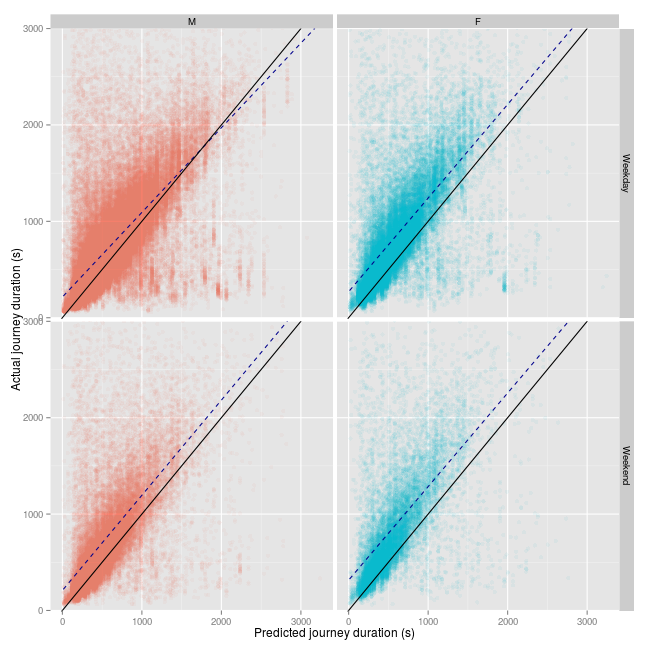
The first thing we can take away from this plot is that the Google API is quite optimistic about its predictions of cycling journey time sin New York City: most journeys take longer than it predicts; although of course, it is not clear whether this is simply because people are not taking the most direct route.
The second thing that comes out is that for men, it appears that for journeys of longer than 2000 seconds during the week, actual journey times are shorter than the Google prediction. Note that this is just a guide, this model would not satisfy the usual assumptions of a linear model.
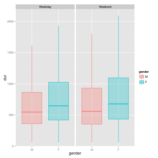
The regression lines tend to suggest that mens’ journey time on the same journeys are simply shorter than womens’. We can see this more clearly in a boxplot:
However, it would better if we could look at the average of each journey time for each journey against each other for men and women, as the plots above are not from a uniform number of journeys for each sex. We can look at the distance taken, or the speed:
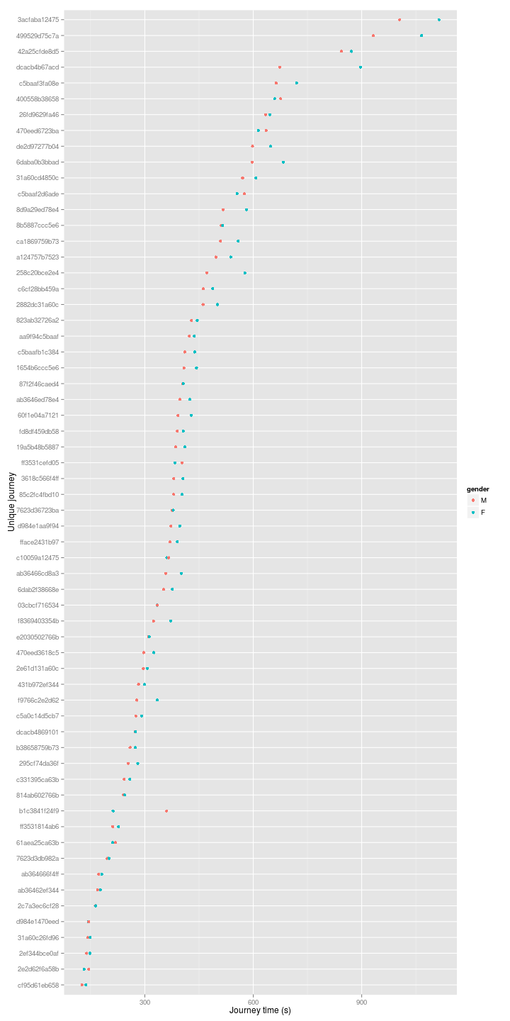
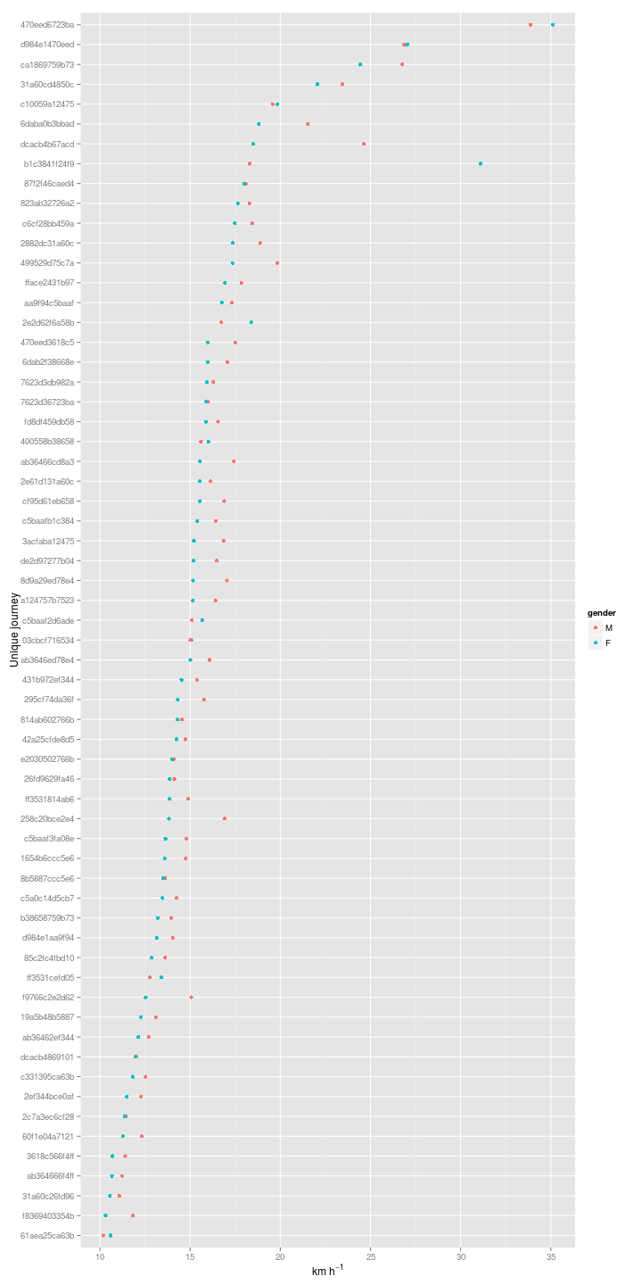
Almost across the board men simply are riding faster than women for the given journeys. But I was also finding something strange with a couple of journeys (cropped out of the above plot). Both appear to be taking place at spends of greater than 50 or 100 km/h…
## Source: local data frame [4 x 6]
## Groups: journey
##
##        journey gender   n    m     speed   dur
## 1 3014023d582f      M 121 8449 105.24706 289.0
## 2 3014023d582f      F  66 8449  92.03168 330.5
## 3 301402dac06a      M 102 8039  64.09842 451.5
## 4 301402dac06a      F  18 8039  54.12143 535.0
So that is a bit bizarre…according to Google, two journeys of over 8 km are being completed in between 200 and 600 seconds. These are the journeys:
It’s not immediately clear what’s going on here. This is probably an issue with the way I hashed the data, as it appears to affect journeys from one particular station. I’ll investigate another day.
sessionInfo()## R version 3.1.3 (2015-03-09)
## Platform: x86_64-pc-linux-gnu (64-bit)
## Running under: Ubuntu 14.04.2 LTS
##
## locale:
## [1] LC_CTYPE=en_GB.UTF-8 LC_NUMERIC=C
## [3] LC_TIME=en_GB.UTF-8 LC_COLLATE=en_GB.UTF-8
## [5] LC_MONETARY=en_GB.UTF-8 LC_MESSAGES=en_GB.UTF-8
## [7] LC_PAPER=en_GB.UTF-8 LC_NAME=C
## [9] LC_ADDRESS=C LC_TELEPHONE=C
## [11] LC_MEASUREMENT=en_GB.UTF-8 LC_IDENTIFICATION=C
##
## attached base packages:
## [1] methods stats graphics grDevices utils datasets base
##
## other attached packages:
## [1] mapproj_1.2-2 maps_2.3-9 magrittr_1.5 ggmap_2.4
## [5] ggplot2_1.0.0 lubridate_1.3.3 dplyr_0.4.1 testthat_0.8.1
## [9] knitr_1.9
##
## loaded via a namespace (and not attached):
## [1] assertthat_0.1 colorspace_1.2-5 DBI_0.3.1
## [4] digest_0.6.4 evaluate_0.5.5 formatR_1.0
## [7] geosphere_1.3-11 grid_3.1.3 gtable_0.1.2
## [10] jpeg_0.1-8 labeling_0.3 lattice_0.20-30
## [13] lazyeval_0.1.10 MASS_7.3-39 memoise_0.2.1
## [16] munsell_0.4.2 parallel_3.1.3 plyr_1.8.1
## [19] png_0.1-7 proto_0.3-10 Rcpp_0.11.5
## [22] reshape2_1.4.1 RgoogleMaps_1.2.0.7 rjson_0.2.15
## [25] RJSONIO_1.3-0 scales_0.2.4 sp_1.0-17
## [28] stringr_0.6.2 tcltk_3.1.3 tools_3.1.3