
I went to my first LondonR meeting tonight hosted by Mango solutions. Some really great talks - especially presentatiosn by Matt Sundquist of plotly.
Mango solutions also presented a good introduction to ggvis and some of the interactive elements. I’ve included my notes from the event below. Note that the visualisations from ggvis will not render properly here. You will need to reproduce the document in RStudio to see them.
Note that much of the code used for ggvis had already become deprecated!
library(dplyr)
library(ggplot2)

tubeData <- read.table(
  "tubeData.csv",
  sep = ",",
  header = T
  )

str(tubeData)
## 'data.frame': 1050 obs. of 9 variables:
## $ Line : Factor w/ 10 levels "Bakerloo","Central",..: 1 1 1 1 1 1 1 1 1 1 ...
## $ Month : int 1 2 3 4 5 6 7 8 9 10 ...
## $ Scheduled: num 29.4 29.4 29.3 29.3 29.3 ...
## $ Excess : num 6.04 6.54 4.77 5.4 5.23 5.03 5.14 5.73 4.8 5.95 ...
## $ TOTAL : num 35.5 36 34.1 34.7 34.5 ...
## $ Opened : int 1906 1906 1906 1906 1906 1906 1906 1906 1906 1906 ...
## $ Length : num 23.2 23.2 23.2 23.2 23.2 23.2 23.2 23.2 23.2 23.2 ...
## $ Type : Factor w/ 2 levels "DT","SS": 1 1 1 1 1 1 1 1 1 1 ...
## $ Stations : int 25 25 25 25 25 25 25 25 25 25 ...Outline
- ggplot2
- ggvis
- %>%
- Aesthetics
- Layers
- Interactivity
The Data
- Tube performance data from TFL website.
- Available here
ggplot2 recap
qplotorggplot- Add layers with +
- Change aesthetics by variable with
aes - Control plot type with
geom - Panel using
facet_
head(tubeData)## Line Month Scheduled Excess TOTAL Opened Length Type Stations
## 1 Bakerloo 1 29.42 6.04 35.46 1906 23.2 DT 25
## 2 Bakerloo 2 29.42 6.54 35.96 1906 23.2 DT 25
## 3 Bakerloo 3 29.30 4.77 34.08 1906 23.2 DT 25
## 4 Bakerloo 4 29.30 5.40 34.70 1906 23.2 DT 25
## 5 Bakerloo 5 29.30 5.23 34.53 1906 23.2 DT 25
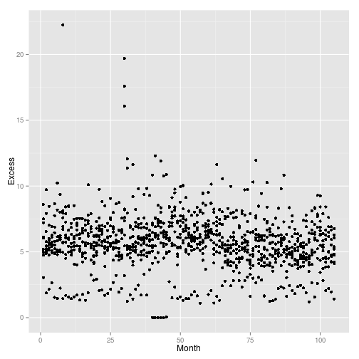
## 6 Bakerloo 6 29.30 5.03 34.33 1906 23.2 DT 25qplot(
data = tubeData,
x = Month,
y = Excess
)
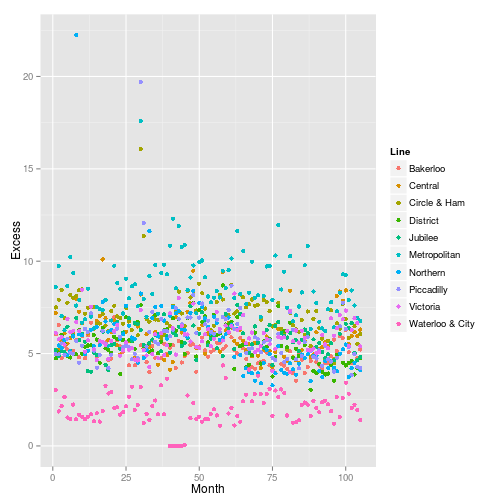
qplot(
  data = tubeData,
  x = Month,
  y = Excess,
  col = Line
  )
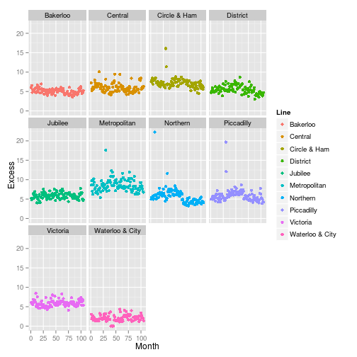
qplot(
  data = tubeData,
  x = Month,
  y = Excess,
  col = Line
  ) +
  facet_wrap(
    ~Line
    )
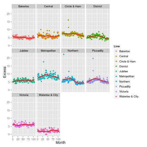
qplot(
  data = tubeData,
  x = Month,
  y = Excess,
  col = Line
  ) +
  facet_wrap(
    ~Line
    ) +
  geom_smooth(
    col = "red",
    size = 1
    )
The ‘geoms’
grep(
  "geom",
  objects("package:ggplot2"),
  value = TRUE
  )
## [1] "geom_abline" "geom_area" "geom_bar"
## [4] "geom_bin2d" "geom_blank" "geom_boxplot"
## [7] "geom_contour" "geom_crossbar" "geom_density"
## [10] "geom_density2d" "geom_dotplot" "geom_errorbar"
## [13] "geom_errorbarh" "geom_freqpoly" "geom_hex"
## [16] "geom_histogram" "geom_hline" "geom_jitter"
## [19] "geom_line" "geom_linerange" "geom_map"
## [22] "geom_path" "geom_point" "geom_pointrange"
## [25] "geom_polygon" "geom_quantile" "geom_raster"
## [28] "geom_rect" "geom_ribbon" "geom_rug"
## [31] "geom_segment" "geom_smooth" "geom_step"
## [34] "geom_text" "geom_tile" "geom_violin"
## [37] "geom_vline" "update_geom_defaults"Facetting
- Panels using
facet_wrapandfacet_grid.
Scales and themes
- axes and styles
- themes e.g.
theme_bwetc
qplot(
  data = tubeData,
  x = Month,
  y = Excess,
  col = Line
  ) +
  facet_wrap(
    ~Line
    ) +
  geom_smooth(
    col = "red",
    size = 1
    ) +
  theme_bw()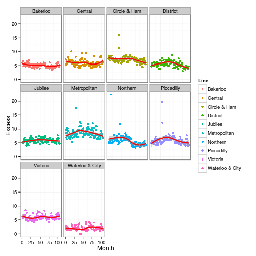
Getting started with ggvis
- Plot with
ggvisfunction - Only a single function unlike
ggplot1 - Use
~when referring to variables in a dataset, e.g.~Ozone - This refers to variables as formulas
- First variable always data.
require(ggvis)

myPlot <- ggvis(
  tubeData,
  ~Month,
  ~Excess
  )


# Creates a ggvis object:

class(myPlot)
## [1] "ggvis"# Graphic is produced in the Viewer pane, not the Plots pane. Works via java vega a .d3 package
myPlot# Note settings cog in the top right which allows you to change the rendering of teh plot.
# Can view in web browser and then be saved as an html file.
# Because it is not written to standard plotting device, you need to render the graphoc before you can save it out - i.e. no png or pdf command
# No equivalent script to save out of ggvis - must be saved from a browser
layer_points(myPlot)# Can also be used in the pupe
myPlot %>% layer_pointsThe %>% operator
ggvisuses%>%frommagrittrlikedplyr
mean(airquality$Ozone,na.rm=TRUE)## [1] 42.12931# Now with the pipe
airquality$Ozone %>% mean(na.rm = TRUE)## [1] 42.12931# dplyr example
require(dplyr)
tubeData %>%
dplyr::group_by(Line) %>%
dplyr::summarise(mean = mean(Excess)) %>%
qplot(Line, mean, data = ., geom="bar", stat = "identity", fill = Line)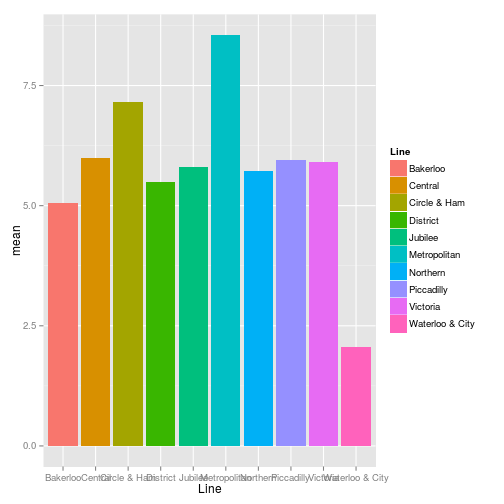
%>% in ggvis
- We pass
ggvisobjects mostly. - All functions accept a ggvis object first, except the command
ggvis - Initial
ggvisobject is created with theggviscommand. - e.g.:
tubeData %>%
  ggvis(
    ~Month,
    ~Excess
    ) %>%
layer_pointsChanging properties
- Properties in
ggvisare the same as aesthetics inggplot2 - Number of aesthetics that can be set:
- stroke – refers to lines
- fill
- size
- opacity – instead of alpha
Changing based on variables
- Mapping and setting as with
aes - Map a variable to a property with
= - Remember to use
~with all variable names - fill = ~Line would set the fill based on the Line variable
tubeData %>%
  ggvis(
    ~Month,
    ~Excess
    ) %>%
  layer_points(
    fill = ~Line
)tubeData %>%
ggvis(
~Month,
~Excess
) %>%
layer_points(
fill = ~Line,
shape = ~Line
)tubeData %>%
ggvis(
~Month,
~Excess
) %>%
layer_points(
size = ~Stations
)# can be set for all layers:
tubeData %>%
ggvis(
~Month,
~Excess,
fill = ~Line
) %>%
layer_pointsSetting property values
- Instead of
col = I("red")inggplot2is not required. This preventsggplot2picking red up as a fcator. fill := "red"will work inggvis
tubeData %>%
  ggvis(
    ~Month,
    ~Excess,
    fill = "red",
    opacity := 0.5
    ) %>%
layer_pointstubeData %>%
ggvis(
~Month,
~Excess,
fill := "red",
opacity := 0.5
) %>%
layer_points- Shaping has changed in ggvis as it is dependent on .d3
- At the moment a limited subset only is available
tubeData %>%
  ggvis(
    ~Month,
    ~Excess,
    fill := "red",
    opacity := 0.5,
    shape := "square"
    ) %>%
layer_pointsExercise
- Create a plot of
mpgagainstwtusingmtcarsdata - Use colour for the
cylvariable, and make it a factor - Update the plotting symbol to be triangles
mtcars %>%
  ggvis(
    ~mpg,
    ~wt
    ) %>%
  layer_points(
    fill = ~factor(cyl),
    # Why doesn't this work!?
    shape := "triangle-up"
)Adding layers
- In
ggviswe uselayer_instead ofgeom_ - Major limitation of
ggvisat present, as not all of thegeoms_are vailable aslayer_inggvis. - Check package manual:
tubeData %>%
  ggvis(
    ~Line,
    ~Excess
    ) %>%
layer_boxplots()# Adding some extra layers
mtcars %>%
ggvis(
~mpg,
~wt
) %>%
layer_points(
fill = ~factor(cyl),
# Why doesn't this work!?
shape := "triangle"
) %>%
layer_smooths() %>%
layer_model_predictions(
model = "lm"
)# Note that formula can be specified with formula = ...
mtcars %>%
ggvis(
~mpg,
~wt
) %>%
layer_points(
fill = ~factor(cyl),
# Why doesn't this work!?
shape := "triangle"
) %>%
layer_smooths(
stroke := "blue",
se = TRUE
) %>%
layer_model_predictions(
model = "lm",
stroke := "red",
se = TRUE
)Making plots interactive
Basic interactivity
- Most basic level is ‘hover over’ just like in javascript.
- Properties of the properties are changed to achive this.
property.hoverargument:fill.hover := "red", orsize.hover,opacity.hover, etc.
tubeData %>%
  ggvis(
    ~Month,
    ~Excess
    ) %>%
  layer_points(
    fill = ~Line,
    fill.hover := "red",
    size.hover := 1500 # sizes are very different to R graphics!
)# This behaviour is saved into the html or svg file!Tooltips
add_tooltipadds other behaviour on hover..- We can provide a function that provide information as we hover.
tubeData %>%
  ggvis(
    ~Month,
    ~Excess
    ) %>%
  layer_points(
    fill = ~Line,
    fill.hover := "red",
    size.hover := 1500 # sizes are very different to R graphics!
    ) %>%
  add_tooltip(
    function(data) data$Excess
)# Locks off R console - cannot be used in markdownpkData$id <- seq_along(pkData$Subject)
all_values <- function(x) {
}
pkData %>% ggvis(
~Time,
~Conc,
key = ~id # ggvis defined
) %>%
layer_points() %>%
add_tooltip(
all_values,
"hover"
)Interactive input
- We can set outputs to be taken from interactive inputs
opacity := input_slider(0,1, label = "Opacity")
- We use the
":="for this input - We can optionally set labels next to the control - unlink
shinywhere it is not optional - Currently you are limited to changing the properties of the data, not the data itself.
tubeData %>%
  ggvis(
    ~Month,
    ~Excess
    ) %>%
  layer_points(
    fill = ~Line,
    size := input_slider(10,1000, label = "Size of points")
)Interactive input functions
tubeData %>%
  ggvis(
    ~Month,
    ~Excess
    ) %>%
  layer_points(
    size := input_numeric(30, label = "Size"),
    opacity := input_slider(0,1,value = 0.7, label = "Opacity"),
    fill := input_select(c("red","blue","orange"), label = "Colour")
)Common plot functions
Controlling axes and legends
- We can control the axes using the add_axis function
- This controls acis labels, tick marks and even grid lines
- Title workaround is to use
add_axis
add_axis("x", title = "Month")
add_axiscontrols colour of gridlines, etc- The
add_legendandhide_legendfunctions allow use to control if we see a legend and wheere it appears
add_legend("fill")
add_legend(c("fill","shape"))
Scales
- ggvis had fewer scale functions than in
ggplot2but control much more. - just seven functions at present
grep(
  "^scale",
  objects("package:ggvis"),
  value = TRUE
  )
## [1] "scale_datetime" "scaled_value" "scale_logical" "scale_nominal"
## [5] "scale_numeric" "scale_ordinal" "scale_singular"ggvis vs ggplot2
- we can layer graphics in a simlar fashion
- aesthetics can be set baswed on by variables in the data
- We cancontrol the type of plot
How are they different?
- Only one main function
- Layering with
%>% - Fewer scale functions
- Much functionality not available… but coming…
Which should I use
- Static graphics:
ggplot2 - Interactive graphics
ggvis