
Last year I played around a bit with the New York Citibike data, and looked a little bit at the different use patterns among among the sexes, and between subscribers and ad hoc users of the service.
Being an Englishman, I was also wondering if there were differences between the patterns of bike usage on different sides of the Atlantic, so I recently got hold of the 20 million odd records of Barclay Bike data from the Transport for London open data portal.
There are some differences between what has been included in the TFL and Citibike data. Most notably we get less information about who is using the London bikes - the records are not split by user type, so we cannot tell regular users from occasional ones as in the NY data. This is a shame, because there are some very interesting patterns of usage that emerge from the NY data when you split by subscribers and occasional users: what seems essentially to be commuters and tourists.
Weather data
There are lots of other datasets available from New York and London which we can combine with these data; one of the most obvious is weather data. Data from weather stations all over the world are available from the NCDC.
I’ve worked with weather data from NCDC before, so already I have some scripts for tidying up this data. A full description of the data is available here, but for simplicity I’m just going to look at daily mean temperature.
The code is pretty straightforward, so I’ll skip to some analysis, but as ever, all the code used to render this (and all other posts) can be found on github1.
Here’s how I’m going to go about it:
- Find active weather stations close to the bike stations.
- Check the coherency of the data from these stations.
- Aggregate bike journeys into number of daily journeys.
- Combine daily bike journeys with ‘global surface summary of the day’ (GSOD) data.
- Make some interesting insights (or something…)
Find weather stations
It can be a little hard to find out exactly which stations are operating, and exactly where they are. I’ve found that stations metadata can be a bit out of date, so I tend to go for a brute force approach. For the New York weather data, I pulled all of the data for the corresponding time period from all the stations in New York State.
For the UK you can’t easily limit the data down to the greater London region, so I just pulled all the UK data for the appropriate time period.
New York
So I’ll start by seeing which weather stations are available in the local area. And because I selected a date range when I selected the data to download from the NCDC, I already know that these stations were active for at least part of the time period that we are interested in.
The lines in the plot below originate at the centroid of all the bike hire stations.
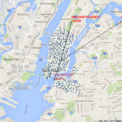
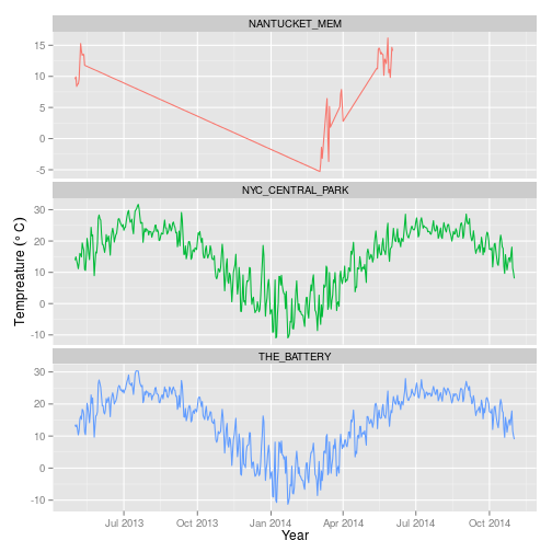
So it turns out that there are four weather stations in close proximity to the bike hire stations in New York. One (THE_BATTERY) appears to be at the end of a pier, so these measurements may not be completely representative of conditions within the city.

That said, the other two likely candidates are within central park, and the final one is round 7 km from the middle point of the Citibike stations at La Guardia airport, so again, this may not be particularly representative.
In the following table I have calculated linear distance from the centroid of bike stations to the individual weather stations using code from an excellent post on the subject here (in metres). Begin and end refer to the start and end of weather records.
## Source: local data frame [3 x 7]
##
##      stn             name    lat     lon    dist      begin        end
## 1 725053 NYC_CENTRAL_PARK 40.779 -73.969 3572.57 2013-01-01 2013-07-06
## 2 725060    NANTUCKET_MEM 40.779 -73.969 3572.57 2010-08-01 2012-12-31
## 3 997271      THE_BATTERY 40.700 -74.000 1811.78 2005-01-04 2013-07-05
London
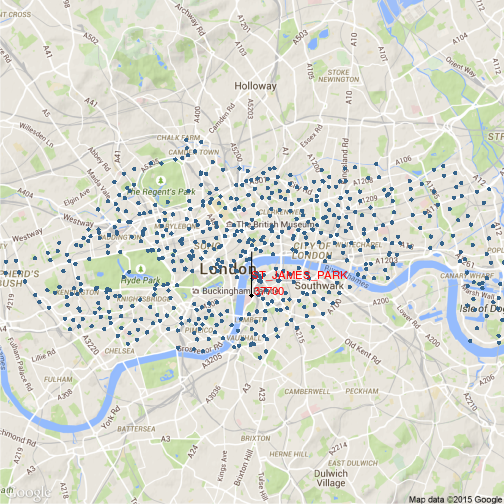
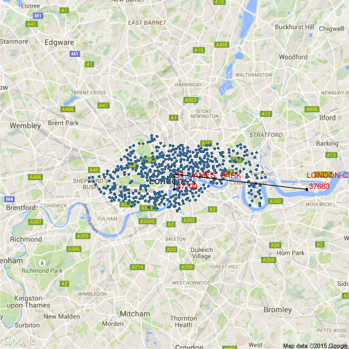
So what about London? There are two stations in the locality, one at St. James’s Park, the other slightly further out at London city airport. The St. James’s Park station is less than 800 m from the centroid of the Barclay Bike stations, so it should do nicely.
## Source: local data frame [2 x 7]
##
##     stn          name  lat    lon    dist      begin        end
## 1 37683   LONDON-CITY 51.5  0.050 3541.68 1988-01-29 2013-07-05
## 2 37700 ST_JAMES_PARK 51.5 -0.117  764.03 2009-12-18 2013-07-05
And London City airport…
Checking the data
Next thing is to have a look at the integrity of the data coming from these stations.
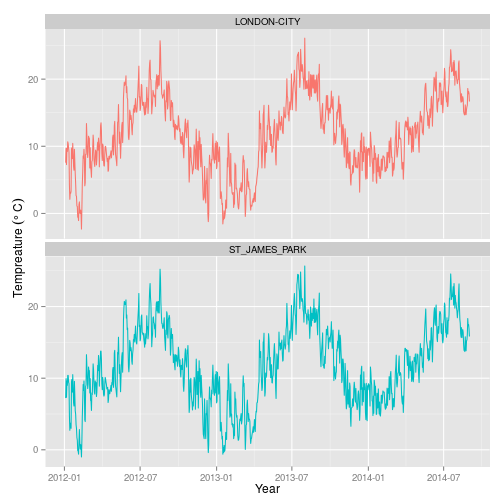
It’s pretty clear that we can discard one of the NY met stations pretty quickly - the Nantucket memorial station has a very incomplete record indeed. And whilst the pattern is very similar, it looks as if the records from the the riverside battery station are a few degrees cooler than the Central Park measurements, so it may not be wise to include measurements from it either.
And what about London? Records from the St. James’s Park and London City airport stations look pretty similar, but the latter is a few kms away from the bike stations. Since the St. James’s Park station is so close to the centroid, it makes sense just to use measurements from this station.
Making some insights
So having combined the weather data with daily journey counts, this is what comes out:
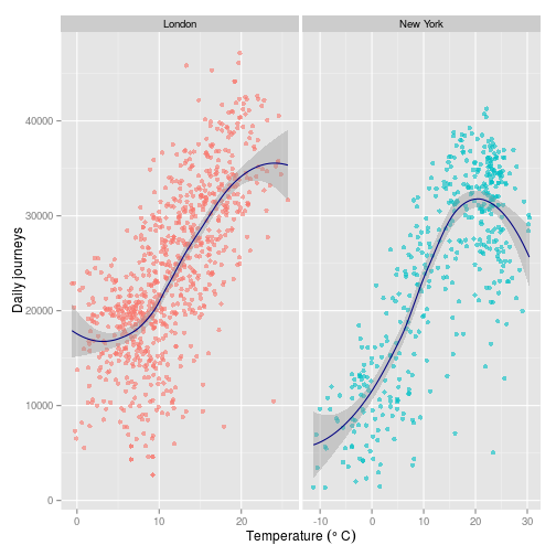
The first thing we can say is that New York has much greater extremes of weather than London - no surprise here (note the x axes deliberately not to the same scale).
The response of the bike users to these extremes is much more interesting. In New York, the number of Citibike users drops off after about $20\,^{\circ}\mathrm{C}$, whilst in London we just get the hint of a drop off closer to $25\,^{\circ}\mathrm{C}$, which is more or less the maximum temperature recorded.
Since the NY data also records some information about the type of user, we can drill down a little further.
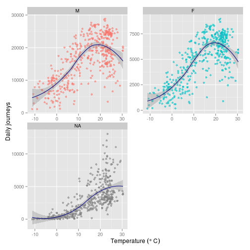
The male and female subscribers both show a pretty similar pattern which is obviously driving the shape of the curve we saw in the plot before. The NAs, which are made up of occasional users without subscriptions (for which we might assume tourists) show a very different pattern.
Up to the maximum temperature of around $30\,^{\circ}\mathrm{C}$, the number of daily journeys slowly creeps up, and shows none of the steep drop off around $20\,^{\circ}\mathrm{C}$ evident among subscribers. In fact, the pattern is a lot more like that shown in the first plot for London users.
A whole load of caveats
So this is a probably an oversimplistic way of looking at things. Some of the other questions we might consider are: what about other environmental variables: rainfall, snow depth, wind speed (which are all likely to be correlated with temperature). And what about weekday, maybe there will be different patterns for weekends and working days? I’ll pick these interactions apart in a future post.
And what about 19 August 2012?
Trying to work out what is behind some of these outliers is an interesting question - like 19 August 2012 in London:
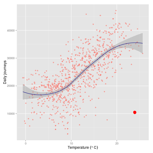
A cursory Google search reveals nothing of note, but there were only a third of users on bikes compared to the two subsequent years.
## Source: local data frame [3 x 7]
##
##   year       date   obs  TEMP   city month day
## 1 2012 2012-08-19 10455 23.94 London     8  19
## 2 2013 2013-08-19 30657 18.06 London     8  19
## 3 2014 2014-08-19 31121 13.89 London     8  19
It was the hottest day of 2012, and did happen to fall on a Sunday…
## Source: local data frame [5 x 8]
##
##   year       date   obs  TEMP   city month day    wday
## 1 2012 2012-08-19 10455 23.94 London     8  19  Sunday
## 2 2012 2012-08-20 37591 20.61 London     8  20  Monday
## 3 2012 2012-08-21 38769 19.06 London     8  21 Tuesday
## 4 2012 2012-09-03 33064 19.28 London     9   3  Monday
## 5 2012 2012-09-04 40957 19.00 London     9   4 Tuesday
but usage was still markedly lower than other warm weekend days in 2012…
## Source: local data frame [5 x 8]
##
##   year       date   obs  TEMP   city month day     wday
## 1 2012 2012-08-19 10455 23.94 London     8  19   Sunday
## 2 2012 2012-08-25 27566 16.94 London     8  25 Saturday
## 3 2012 2012-08-26 17950 17.28 London     8  26   Sunday
## 4 2012 2012-09-08 36809 18.44 London     9   8 Saturday
## 5 2012 2012-09-09 40974 18.78 London     9   9   Sunday
2013…
## Source: local data frame [5 x 8]
##
##   year       date   obs  TEMP   city month day     wday
## 1 2013 2013-07-06 31168 20.83 London     7   6 Saturday
## 2 2013 2013-07-07 34117 21.83 London     7   7   Sunday
## 3 2013 2013-07-13 30579 23.06 London     7  13 Saturday
## 4 2013 2013-07-14 33200 23.50 London     7  14   Sunday
## 5 2013 2013-07-27 31223 20.78 London     7  27 Saturday
and 2014…
## Source: local data frame [5 x 8]
##
##   year       date   obs  TEMP   city month day     wday
## 1 2014 2014-07-19 34686 23.11 London     7  19 Saturday
## 2 2014 2014-07-20 38194 21.00 London     7  20   Sunday
## 3 2014 2014-07-26 27734 23.22 London     7  26 Saturday
## 4 2014 2014-07-27 42620 21.94 London     7  27   Sunday
## 5 2014 2014-08-02 34321 19.39 London     8   2 Saturday
Maybe it was just as nice day for a BBQ?
## R version 3.2.0 (2015-04-16)
## Platform: x86_64-unknown-linux-gnu (64-bit)
## Running under: Ubuntu 14.04.2 LTS
##
## locale:
##  [1] LC_CTYPE=en_GB.UTF-8       LC_NUMERIC=C
##  [3] LC_TIME=en_GB.UTF-8        LC_COLLATE=en_GB.UTF-8
##  [5] LC_MONETARY=en_GB.UTF-8    LC_MESSAGES=en_GB.UTF-8
##  [7] LC_PAPER=en_GB.UTF-8       LC_NAME=C
##  [9] LC_ADDRESS=C               LC_TELEPHONE=C
## [11] LC_MEASUREMENT=en_GB.UTF-8 LC_IDENTIFICATION=C
##
## attached base packages:
## [1] methods   stats     graphics  grDevices utils     datasets  base
##
## other attached packages:
##  [1] mapproj_1.2-2     maps_2.3-9        readr_0.1.0
##  [4] ggmap_2.4         ggplot2_1.0.1     lubridate_1.3.3
##  [7] magrittr_1.5      xtable_1.7-4      dplyr_0.4.1
## [10] checkpoint_0.3.10 testthat_0.9.1    knitr_1.10
##
## loaded via a namespace (and not attached):
##  [1] Rcpp_0.11.6         formatR_1.2         plyr_1.8.2
##  [4] tools_3.2.0         digest_0.6.8        evaluate_0.7
##  [7] memoise_0.2.1       RSQLite_1.0.0       gtable_0.1.2
## [10] lattice_0.20-31     png_0.1-7           DBI_0.3.1
## [13] parallel_3.2.0      proto_0.3-10        stringr_1.0.0
## [16] RgoogleMaps_1.2.0.7 grid_3.2.0          R6_2.0.1
## [19] jpeg_0.1-8          RJSONIO_1.3-0       sp_1.1-0
## [22] reshape2_1.4.1      scales_0.2.4        MASS_7.3-40
## [25] assertthat_0.1      colorspace_1.2-6    geosphere_1.3-13
## [28] labeling_0.3        stringi_0.4-1       lazyeval_0.1.10
## [31] munsell_0.4.2 rjson_0.2.15-
I cheat a little bit in the source code here because the data is reasonably large and takes time to process, so I have already done some of the processing and saved out to .Rdata or .Rds objects. ↩